Flexbox
Flexbox is a relatively new feature of CSS3. It is used to create a "flexible box" that maintains positional integrity no matter what size screen it is on. As you will undoubtedly be developing sites that will appear on large desktop screens as well as 4-inch, mobile phones, it essential to be able to make sites that can stand the test of both.
There are a lot of possibilities with flexbox. Here, I will cover the essentials.
Start
-
You will need a wrapper container (the flexible box). This will be a
divlike element.<div class="flex-parent">
</div> -
Give this wrapper container the CSS property of
display: flex;.flex-parent {
display: flex;
}
Now that the parent is a flexible box, the children of the parent can now be aligned easily, and will keep logical alignment on screens of different sizes.
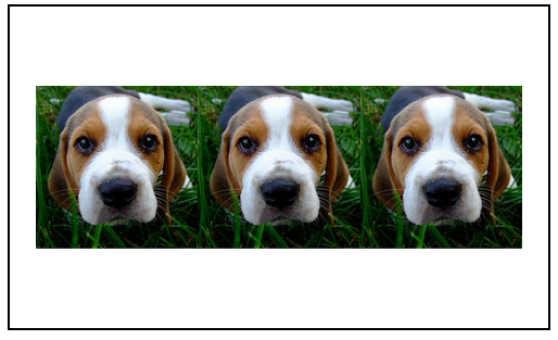
Here is our base setup:
<div class="flex-parent">
  <img src="dog.jpg" alt="beagle puppy" class="dog-img">
  <img src="dog.jpg" alt="beagle puppy" class="dog-img">
  <img src="dog.jpg" alt="beagle puppy" class="dog-img">
</div>
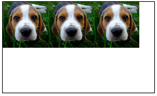
The outer box with the border is our flex container. It has display: flex;. Now we will add more properties to that parent box.
align-items
This will align items before, on, or after the parent's main axis. By default, a flex-displayed element's main axis runs horizontally (like a row or a hamburger).
The values can be flex-start (at the top), flex-end, (at the bottom), or center (in the middle), plus more. Vertically centering items has been a nightmare for CSS-ers for decades. Flexbox makes it dead-simple.
.flex-parent {
  display: flex;
  align-items: center;
}
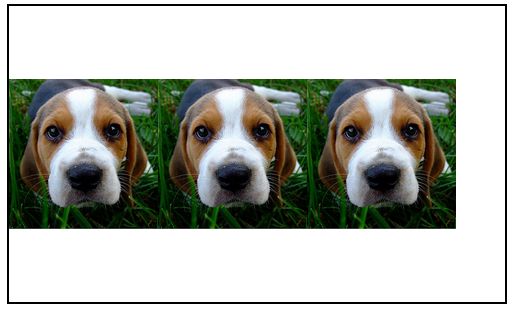
justify-content
This will align content before, on, or after the secondary axis of a flexible box. By default, is the vertical axis (like a column). In other word, by default this aligns elements to the left, middle, or right.
The values can be flex-start (left), flex-end (right), center (middle), plus more.
.flex-parent {
  display: flex;
  justify-content: center;
}
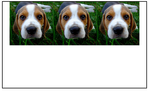
All together
.flex-parent {
  display: flex;
  justify-content: center;
  align-items: center;
}
Flexbox offers so so much more, but centering items is really all you will need to begin.
When you are ready, I highly recommend this flexbox guide although there are many, many more to choose from.
That's it for CSS. It's Git time!